CSS: cascade, layout, and resilient presentation
Understand cascade ownership, intrinsic sizing, responsive layouts, stacking contexts, and the real costs of animation.
CSS separated presentation from document structure so the same content could adapt to different screens, media, and user preferences. Its declarative model lets the browser solve relationships between boxes rather than requiring JavaScript to position every element.
At scale, CSS problems usually concern ownership and constraints: which rule is allowed to win, what may shrink, which coordinate system an element belongs to, and how content changes without a redesign.
The cascade resolves competing owners
The cascade considers origin and importance, cascade layers, specificity, scoping proximity when relevant, and source order. Specificity is not the first comparison across every rule. A highly specific selector in an earlier normal layer can lose to a low-specificity selector in a later layer.
@layer reset, tokens, components, utilities;

@layer tokens {
  :root {
    --space-2: 0.5rem;
    --space-4: 1rem;
    --surface: #ffffff;
    --text: #17211d;
    --border: #ced7d1;
  }
}
@layer components {
  .panel { background: var(--surface); color: var(--text); }
}
@layer utilities {
  .surface-muted { background: #f2f5f3; }
}
This establishes deliberate ordering for normal declarations. Unlayered normal author styles outrank layered normal author styles; important declarations reverse layer priority. Introducing layers into a legacy stylesheet without accounting for those rules can produce surprising results. Keep !important for explicit policy boundaries rather than routine component competition.
Inherited custom properties are useful for design tokens, but a token name should describe a stable responsibility. --button-confirm-background can evolve independently of every green surface. Separate reference values, semantic roles, and component decisions when that separation reduces real change cost.
The box model explains most overflow
With content-box, declared width excludes padding and borders. border-box includes them. Margins remain outside either model. Flex and grid children also have intrinsic minimum sizes; a long unbroken value can prevent a column from shrinking even when the parent appears responsive.
*, *::before, *::after { box-sizing: border-box; }

.workspace {
  display: grid;
  grid-template-columns: minmax(12rem, 18rem) minmax(0, 1fr);
  gap: 1rem;
}
.workspace > * { min-width: 0; }
.record-id { overflow-wrap: anywhere; }
pre { max-width: 100%; overflow-x: auto; }

@media (max-width: 48rem) {
  .workspace { grid-template-columns: minmax(0, 1fr); }
}
minmax(0, 1fr) allows the flexible track to become smaller than its content's intrinsic minimum. The pre receives local scrolling because code has meaningful line structure. Applying overflow-x: hidden to the entire document merely hides the symptom and can conceal controls.
Flexbox, Grid, and component responsiveness
Flexbox distributes items on one main axis and is effective for controls, navigation, and wrapping rows. Grid defines relationships across rows and columns. Choosing between them concerns constraints, not an aesthetic preference.
A reusable card should adapt to its container rather than only to the viewport:
.card-slot { container-type: inline-size; }
.record-card { display: grid; gap: 0.75rem; }

@container (min-width: 32rem) {
  .record-card {
    grid-template-columns: 8rem minmax(0, 1fr) auto;
    align-items: center;
  }
}
The container establishes a queryable inline size. The card can now work in a full-width page or narrow drawer without knowing either layout. A fallback default remains usable if a feature is unavailable. Container queries do not remove the need to handle long translations, zoom, user font settings, or dynamic data.
Use logical properties such as margin-inline and padding-block when the relation is about writing direction. Hardcoded left/right assumptions accumulate migration cost when a product adopts right-to-left layouts.
Positioning and stacking define local worlds
An absolutely positioned element is placed relative to its containing block; a transformed ancestor can change the containing block of fixed descendants. position: sticky needs room to move and is affected by its scrolling ancestors. A z-index value operates within a stacking context, so a child with z-index: 99999 cannot escape its parent's lower stacking context.
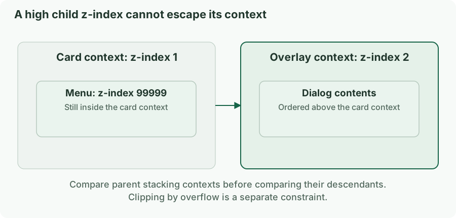
If a menu is clipped by overflow, increasing z-index does not remove clipping. Portals or the browser's top-layer features can solve particular overlay problems, but the interaction still needs focus handling and an accessible name. Treat overlay layering as a shared application contract, especially across teams.
Animation and containment have budgets
Animating width or top often creates layout work; transforms and opacity can avoid some work when the engine can composite them. Neither is a blanket guarantee. Large promoted layers, expensive filters, and enormous images still cost memory and GPU time.
.drawer {
  transition: transform 160ms ease;
  transform: translateX(100%);
}
.drawer[data-open="true"] { transform: translateX(0); }

@media (prefers-reduced-motion: reduce) {
  .drawer { transition: none; }
}
Moving a closed drawer off-screen does not itself make its controls unfocusable or remove them from the accessibility tree. Visibility and interaction state must agree. Use a suitable hidden/inert strategy or a managed dialog pattern, rather than relying on visual displacement.
Containment and content-visibility can limit work for large independent regions, but they change layout and rendering assumptions. Test focus, find-in-page, intrinsic sizing, and scrolling in the actual content. Do not add containment everywhere as a generic optimization.
Diagnose a style bug by identifying the constraint
For an override bug, inspect the winning declaration and its layer before increasing specificity. For overflow, inspect each ancestor's used size and the child's minimum contribution. For a misplaced overlay, inspect containing blocks, clipping, and stacking contexts separately.
Test at 200% and 400% zoom where the layout should reflow, with long translations, empty and maximal data, coarse pointers, and forced colors. Maintain visible focus and avoid representing status through color alone. A resilient stylesheet describes what must remain true as content and environments change.